Whatever your photographic subject, you will want your sepia photography to be excellent. Here are a few tips that have worked well for many of the photographers I know who specialize in sepia photography, including me!
1. Critical in any visual: recognize your light source.
The light source defines the image. You may use one
specific source of light or many, but you should pinpoint the origin(s) of
the light before the first shutter click. Why is this so important?
Light creates form and interest. The light source lets you know where to place your highlights and shadows. The light source actually shapes the highlights and shadows in the image. For example:
this photograph of a charming courtyard I took in Vienna is dappled with shadow from the graceful tree in the near background and trees whose branches frame the upper left boarder but most of which are not seen. The natural light from the upper left/and some center light filters through the leaves to create the lacy shadows. The elegant wrought iron railing also casts some shadows. But notice that where the light is blocked, for instance by the near wall of the stairs, there is a dark shadow , which forms a distinct shape. Too, the facade of the building is in a lighter tone of shadow because the light is not directly illuminating it. The near building on the right is lit by a softer ambient light that we know as daylight and not by specific and direct sunlight.
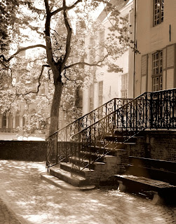 |
| Vienna Courtyard |
2. Define your subject.
Prospect Park in Brooklyn holds many happy childhood memories for me. I especially loved to ride the Carousel and to try to catch the brass ring for a "free" ride. I wanted to capture the magic I felt on those wonderful carefree days in my photograph of the Prospect Park Carousel. The distinct focal point of the image is the structure that houses the Carousel. This is the building that came into view after my trekking across the grassy lawns of the park. The twinkling inner lights beckoned me to the fantasy wooden horses within. The trees and shrubs around the lovely old brick building, somewhat stripped like a circus tent, create a frame and heighten my anticipation of the joys of childhood. As a child, I felt as if the borders of foliage were like gates to pass through to get to the ultimate delight of my Carousel ride(s). In the photograph, I have created a story surrounding the subject of those joys. Identify your subject first and weave a pictorial story around that particular focal point.
 |
Prospect Park Carousel: Brooklyn
|
3. Know if you are going for high or low contrast.
While you are shooting, it is a good idea to decide whether or not you will want your photograph to have high contrast or to have far more subtler tones (low contrast). Perhaps you only work with dark darks and brilliant lights. Then your decision is made for you. Personally, although I think that my photographs are recognizable as my work/style, I prefer not to limit myself by creating only high contrast or low. Therefore, when I am looking at my subjects, I get a feel for the shadows and the afore mentioned light. I decide where the darkest darks are and try to find form and definition in those ares while shooting. There is nothing worse than a black blob in my photograph, except for a white/blown out light. In the brightest lights, I look for detail. Once you have downloaded the shots, even if you are working in the studio, the light has changed. Far better to decide the nature of the photograph while you are taking the pictures.
On the left, I saw the entrance to this grand old Manhattan building from behind a staircase. I was intrigued about coming out of shadow and into the light. The arch and circular motifs added definition to the darks and gave me an opportunity to "glow" the lights through the image. The high contrast theme of the sepia photograph adds to the overall feeling of emerging from shadow to light.
The photograph on the right is a hazy summer's day image that is meant to tell that story. Walking on the road in a New England town, I spied a pretty, old B&B. The sun was shimmering with that warm, fuzzy heat of summer and I liked the subtle tonalities of the scene. It is critical to add some darker and lighter elements to the image to create a feeling of form and space; however, these may be very slight in tonality.
It should be mentioned that high contrast and low contrast sepia are far different from their counterparts in black and white photography. I, personally, find that sepia can be a softer, more delicately muted medium than black and white, even in high contrast sepia images. Slamming in the darks or evoking those blinding lights (always with detail) in sepia photographs still produce a somewhat more understated photograph than the same image in black and white.
 |
| High Contrast/Low Contrast |
4. Understand the tonal properties of sepia.
Sepia, like black and white photography, has specific tonal properties. Sepia is a monochromatic medium, and as such focuses primarily on subject rather than color. Photography, for the most part, seeks to provide three
dimentionality on a two dimensional plane. Even abstracts mainly want to create a certain level of depth and spatial relationship. This is where tone comes in. The tones or values of light and dark in any visual work provide form and depth. Darks usually afford a proximity to the viewer while lights recede into the background/distance. The subject has many tones of dark and light to create that three dimensional feel. Try to find these lights and darks and blend the various tones into your work.
It must also be considered that sepia may be cool or warm as a tone. It is much more color-orientated than black and white, which may also be cool or warm to a certain degree. Whereas black and white does offer an infinite tonality range, sepia goes even further because its origin is in color. It may be noted that I shoot all of my photography in RGB/color, which I believe gives me more opportunity to express subtle shades/tones. However, I certainly respect those photographers who use monochrome to shoot and who have contrasting views to mine regarding tonality and achieving it in photography.
The photograph on the left of the Astor Houses in Harlem is a very cool sepia palette. My intention was to create a tranquil row of houses in a low key tonal range that showcased the beauty and history of the architecture. On the right is a warm sepia photograph taken in Newport, RI. It was a lovely fall day and the warm sepia tones highlight the sunny/shady park-like setting.
Each photograph was originally taken in color. The sepia tones were added after the images were converted to black and white in the computer. I then gradually "built" the sepia tones to where I wanted them.
 |
| Cool Sepia/Warm Sepia |
5. Decide before hand if you are working on individual photographs or a series.
A series of photographs using sepia values is usually more successful if the tonalities are in a similar range and temperature. Of course, that is entirely up to the discretion of the photographer.
The top two (below) photographs are of Miami. The warm tones and the bold contrasts communicate my feelings about the Florida city: heat, shadow, Art Deco, nightlife, tropical. Warm sepia tones with high contrasts.
The center photographs are of Dresden, Germany. I was there in cool weather. The German light is a cooler light at most all times. It has a mystical quality: a soft, tangible feeling of ancient stone and history (although Dresden was rebuilt in the last half century). There is a dreamy quality about the place rather than the roaring vibrancy of Miami. Cool sepia tones in low contrast
Finally, a stand alone view of the Manhattan skyline from Brooklyn. Some tones are warm and some are cool. The darks are more subtle than those in the Miami photographs, but not as ethereal as the Dresden images. In this one photograph, I captured my feelings about looking across the river to the magic spires of the Big Apple.

Last word:
No matter what medium you use for your photography, sepia, black and white or/and color, always find the light and utilize its marvels to enhance your images. Remember to focus on your subject. And, perhaps most important: find your voice through your photography, which ultimately is a form of your self-expression.


